


Pragmatic UX Frameworks
The in-house, no-bullshit approach to UX design behind an industry-leading municipal platform with international reach.

THE CHALLENGES
At a defining time for CITIES, as it transitioned from a startup to a more mature company, the ground-up rework of the platform posed steep leadership challenges.
As a founding product designer, I felt the responsibility to expand my own competencies and lead colleagues toward autonomy and trust.

THE IMPACT
Incredible feedback from team members on the way I approach leadership – with honesty and vulnerability.
"Neutralizing the Noise" – an impact-oriented UX design framework based on common sense.
"The Infinite Diamond" – a task management framework aimed at flexibility.
Three Core Aspects of Success
From my experience, there are three fundamental aspects that will determine the success of any collaborative project to a very high degree.
Unsurprisingly, these three factors are also the most defining elements of a company’s culture, so getting them right is essential.

Communication
I always strive to set up an environment of direct, actionable feedback and autonomy when leading or mentoring. The result is an incredibly high degree of buy-in and ownership of work.
I achieve this by being open about my strengths and shortcomings, and by actively inviting colleagues to solve problems as a team. This inspires internal feelings of contribution, belonging, and motivation.
Mistake Handling
The mindset of learning through trial and error has run through my veins since the early days of learning from obscure forum posts and 240p YouTube videos.
In a professional setting, I handle mistakes by acknowledging them and extracting the lessons without any finger-pointing. In a leadership position, I make sure to lead by example and practice what I preach.
Decision Making
I found that two decision-making principles can 10X the effectiveness of almost any organization if practiced faithfully:
Disagree and commit – the ability to put trust in your team and follow through with an idea, even if you personally disagree with it.
One-way and two-way doors – separating decisions into those that can be adapted later and those that are final allows for quick handling of low-hanging fruit and resource allocation towards demanding topics.
Managing The Input
As a UX designer at CITIES, I am privileged to have access to the sales, support, and customer success teams, both in the field and in-house, giving me a wide funnel of available feedback channels.
Below are the main sources of input that I considered when exploring what shape the new platform should take.

App & Play Store Feedback

Sales Team Insights

Platform Usage Data

Support Team Emails & Calls

Usability Testing Reports

In-house Suggestions

Competitor Analysis

Lessons Learned
Processing the Data
Raw numbers only tell part of the story. The vital point is extracting value from the data. I used a combination of established UX methods and intuitive, common-sense approaches to break down the numbers.
Cohort Analysis
A cohort analysis based on user behavior is one of my go-to approaches for identifying the underlying patterns across the platform. This helped me pull back the curtain on how the core features, such as the city feed, post creation, and service administration, are used.
VALUABLE INSIGHT
The administrators with a complete page profile were 2-5X more likely to post actively than those with empty pages.
Based on this a page onboarding & setup flow was concieved, which contributed to a 51% increase in administrator engagement.
Predictive Scenarios
The way I like to ground raw numbers is by constructing a set of projected theories about how a product would work in a perfect world, as described in "The Lean Startup" by Eric Ries.
I then validate these theories through the launch of the MVP by tracking specific, predetermined KPIs.
Shaping The Vision
The Landscape
A key to delivering a compelling product portfolio was understanding the target audience.
Since the product portfolio covers everything from regular citizens to enterprise administrators, the challenge lay in presenting tailored experiences for the needs of each user group at exactly the right time.


Citizens
The end users, the citizens and tourists, needed a reliable, up-to-date source of information that captures the genuine heartbeat of their city.
Business Owners
For the customers who run a business or a non-profit association, the path was clear: simple administration and eyes on the content.
Municipality Admins
For the enterprise municipality partners, an overview of services and centralized administration of every aspect of the city was vital.
The Meetings
Shaping a product vision for a complex, interconnected product portfolio is a hugely collaborative process. This means meetings. A lot of meetings. And meetings get a terribly bad rep in tech.
My approach is to reframe the meeting culture to achieve better buy-in.

Diplomatic Innovation
Meetings are susceptible to wasting people’s time through flawed execution, lack of structure or unclear goals.
Shifting to collaborative workshops solves this by adding a moderator who oversees the agenda, sets time limits for both discussion and quiet contemplation, and tables off-topic conversations for later.
The Design Pipeline

Neutralizing The Noise
After spending a decade in the industry, I gradually realized that if I wanted a UX design framework that goes beyond abstract methodology and focuses on real-world impact, I’d have to create one myself.
That is how "Neutralizing The Noise" was born.
This approach focuses on removing all bottlenecks and pain points from the product development process by adapting at every step, and resolving high-impact problems first then working your way down.

The Infinite Diamond
Another step forward was crafting a task management framework that could keep up with the demands of a dynamic startup environment prioritizing output and flexibility.
This is how "The Infinite Diamond" emerged.
A diamond shape which breaks down the design process into its two core aspects: deep understanding and high impact output.
It can be scaled and chained as needed to reduce the complexity of large projects, manage switching costs, and plan the roadmap.
Crafting The Product
Keep Things Moving
In the early stages of a massively complex project, the most impactful decisions happen while sketching on a whiteboard or flowcharting in FigJam during workshops, meetings, or spontaneous chats.
These methods are top-notch in terms of speed and fluidity when the main purpose is making sense out of noise and moving things forward.
I use them throughout the stages of a project for quick iterations, flushing out edge cases, and ideating abstract concepts.
Image 06
-
Sketching & flowcharting

Look Dev
There is an integral step in the VFX pipeline called Look Dev. It involves exploring different visual and technical styles to preview before deciding on the desired final aesthetic.
I have a similar approach in product design. Digital products truly breathe and stretch their wings in high fidelity, so I bring them there very early.
This has proven to have a massively positive effect on the motivation of both the development team and external stakeholders.

Avoiding Dead Ends
Working with mid-fidelity wireframes leads to misappropriating hierarchy, scale, and space, leaving you to deal with those details in final screens.
Going high fidelity early allows me to avoid layouts that might not be executable in development because of unexpected element sizing, screen spacing or similar factors.
Solving With Pixels
When working on digital products, you eventually have to solve the challenges in pixels.
This includes platform-specific patterns, like the quirky components and colors of Material Design or the vibrant blur effects of iOS.
The way I treat product design is to resolve critical pain points first, get everyone on the same page, and then commit to exploring the real feel of the product in high fidelity.
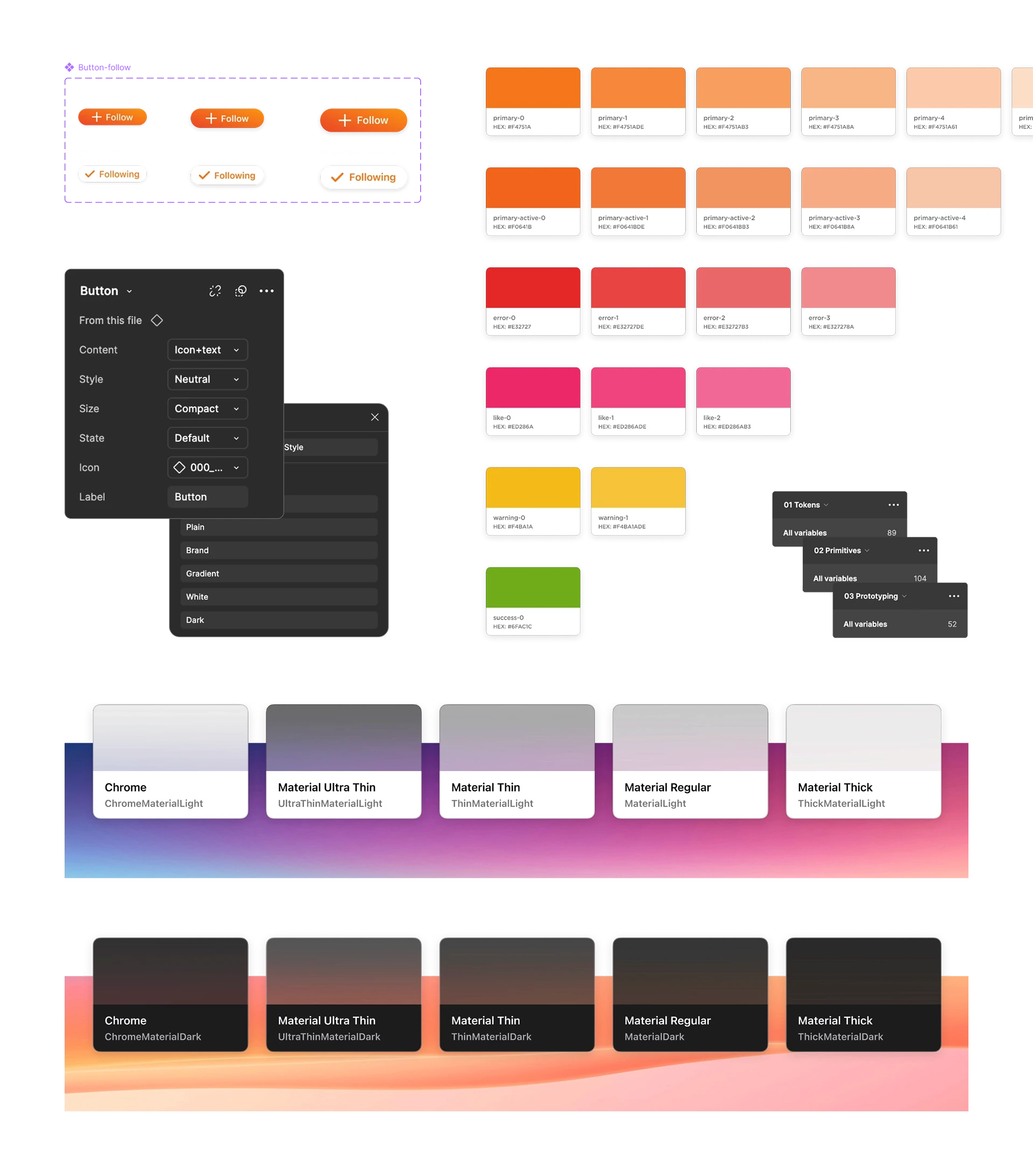
Systemic Design
Many designers struggle with the fact that a design system is not just a Figma file, but a set of principles that lives across the design files, tech stack and the hearts of minds of both designers and developers.
A Problem-Solving Framework
Most challenges that pop up within a mature product stack have already been solved in the past. A well-rounded design system serves as a framework for solving problems in a time-efficient manner.
A seasoned designer knows when to stretch or break the boundaries of the system if needed and how to retroactively apply the updated principles back into the system for future use.
A Shared Vision
The most underrated payoff of a design system is that it helps create a unified vision in the minds of everyone involved.
This makes it easier to discuss concepts and refine ideas, reduces the steps needed to reach decisions, and smooths the process by providing a tangible reference point during development.

In Anticipation of Release
During development, a constant guerrilla-style testing with colleagues, stakeholders, and friends was used, along with moderated usability sessions to sanity-check more tangled ideas.
However, the moment of truth came with the company-wide stress testing session.
MVP Stress Test
A focused, multi-week, company-wide testing period was put in place with time allocated for design improvements and bug fixes.
The weeks-long session was not only about fixing bugs and testing the infrastructure along with the UX, but also, crucially, about collecting data that might help us predict what could happen at launch.
112 bugs or UX inconsistencies were resolved during this period.
Validated Learning
The worst way to gather feedback from a release is to just wait and see as the numbers and responses start rolling in.
Before launch I set up a specific set of KPIs to track, such as average time spent on posts or number of page visits, based on cohorts of users who access the app multiple times a day, daily or weekly.
Along with tracking, I also laid out rough outlines for how to react when things go wrong.
Major improvement to tab handling was incorporated quickly after launch, always leading the users back to the last active tab.
The Success Since
A big release is a turbulent time full of uncertainty and expectation, but the path since has been nothing short of spectacular.
FLEXIBILITY PAYING OFF
The parallel service development proved to be invaluable, allowing for the lightning quick introduction of an integrated website builder with over 100 websites going live since.
DRIVING TEAM GROWTH
By establishing the direct, honest feedback channels and constant retrospectives I achieved a high degree of team member growth and satisfaction.
INTERNATIONAL SUCCESS
Since the implementation of these frameworks, the platform has reached over 250,000 users across more than 300 cities in Austria, Germany, and Switzerland.
